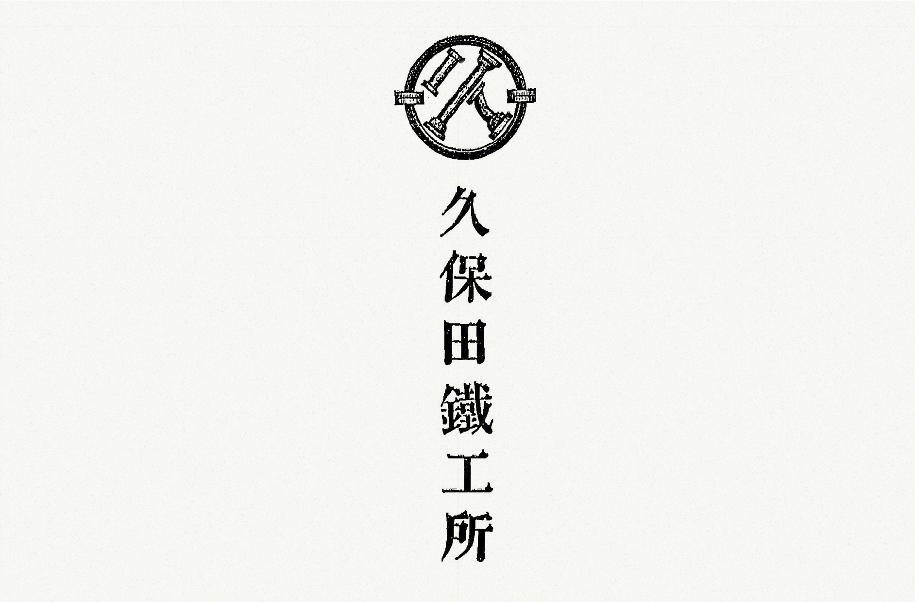
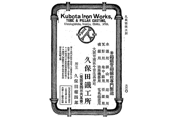
Kubota Casting
1907
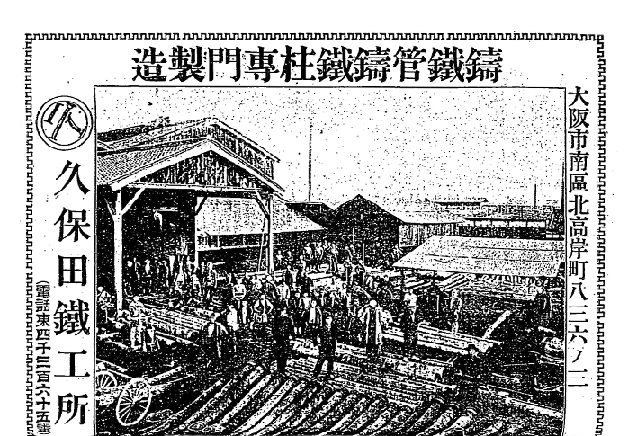
When Kubota was founded, the logo design consisted of the character "Ku" from "Kubota" made from cast iron pipes enclosed in a circle, symbolizing Kubota as a casting company.
1908
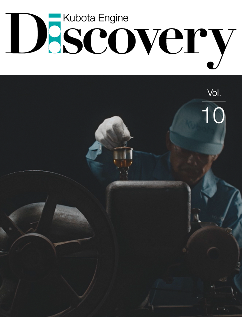
The Birth of Kubota Engine
1922
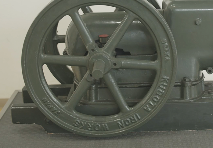
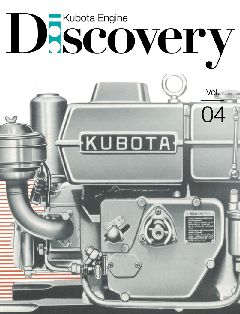
"KUBOTA IRON WORKS" is stamped on the A-type agricultural oil engine, the first engine made by Kubota Engine.
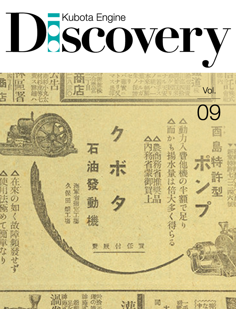
1924
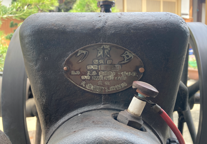
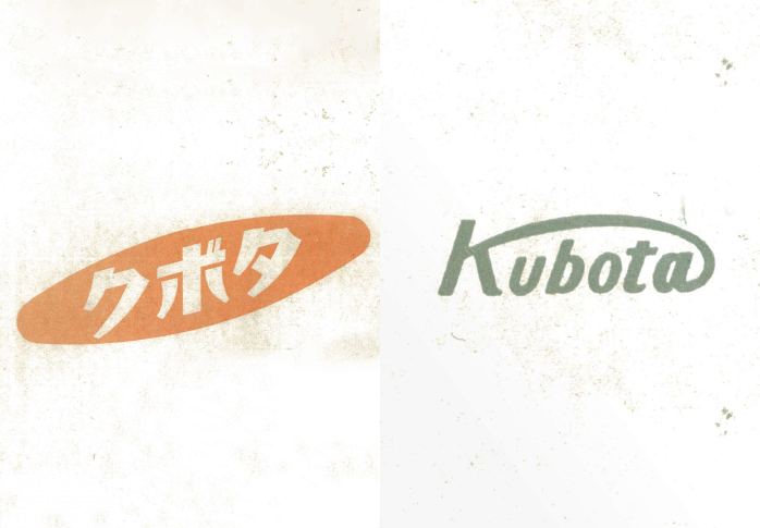
"Kubota" in Japanese katakana characters, inscribed
here, there and everywhere.
This is when Kubota's brand image as the go-to manufacturer for
engines was established.
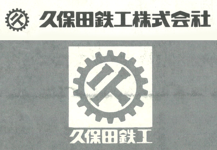
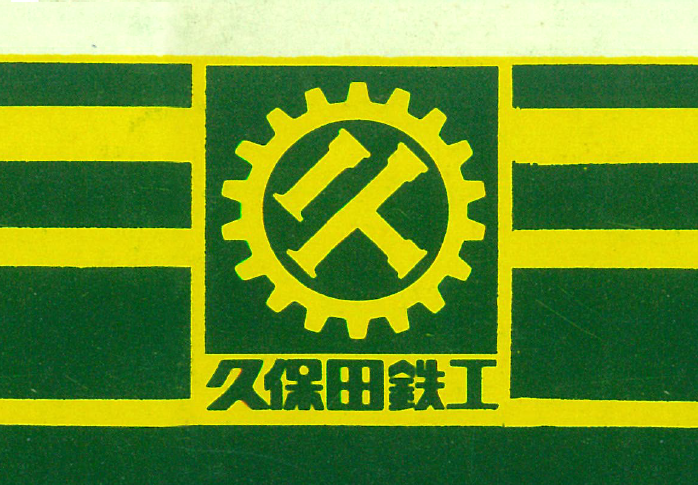
Kubota Casting and Machinery
1930

In 1930, when Kubota started manufacturing diesel engines, the company was reorganized into a corporation and the circle in the logo changed to a gear to represent Kubota's development into both a casting and machinery company. This logo was used as a trademark.
1936
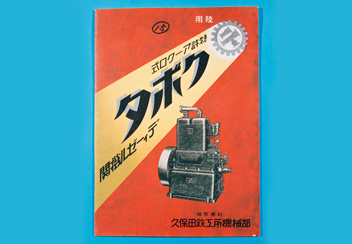
Cover of the brochure for the Acro Engine (Air Cell Engine)
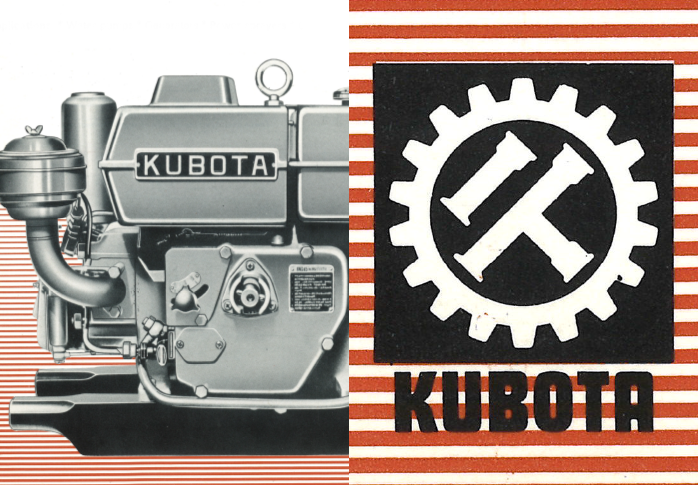
Kubota's trademark as a casting and machinery company,
illuminated by a spotlight
1947
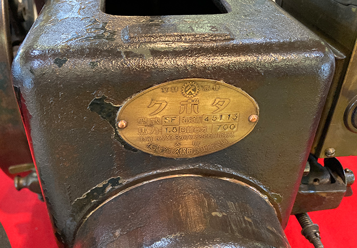
The emblem of the SF-type oil engine
1955
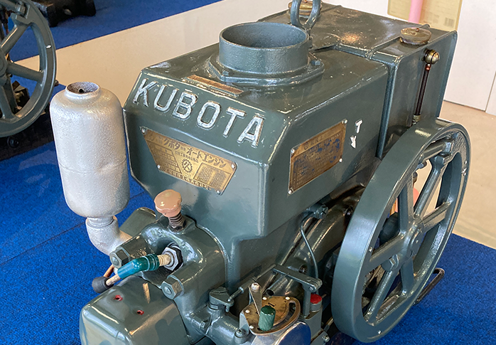
The "KUBOTA" on the body of the AN-type engine using a gothic font gave the design a modern style.
A New Era
1956
A fresh design welcoming in a new era and Japan's period of rapid economic growth.
1971
The trademark and company logo as printed in the operator's manual for the L1500 tractor. The L1500 tractor was equipped with a high-output, low-vibration and low-noise Kubota engine. These features are still present in today's Kubota engines.
A vivid green and yellow version
The Rise of Pop Art
1981
A logo with a pop-art feel evocative of the early 1980s
1983
1989
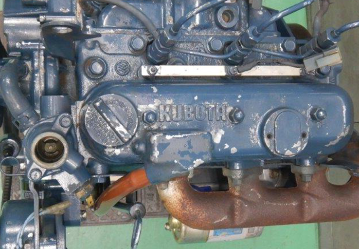
The "KUBOTA" logo on a D905 engine
Supporting Prosperous Lives
1990
A new corporate logo was adopted when the company name changed.
2012

We changed to our current logo to emphasize our brand statement, "For Earth, For Life."